Vuse
Integrated Activation & Ecosystem
Creative Director · Haus of Park
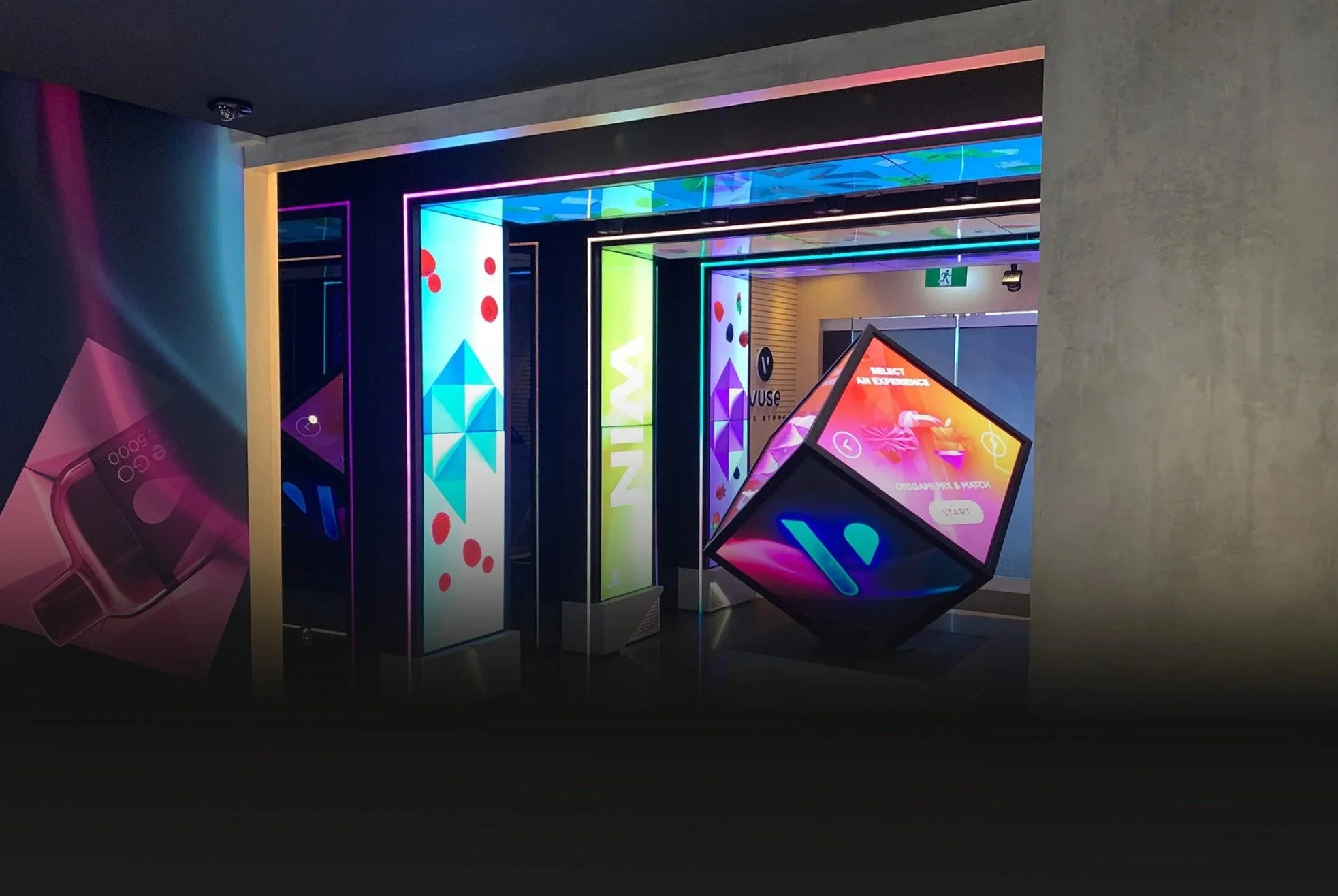
Working within a tightly regulated category, Vuse required ongoing communication that could adapt to changing rules, platforms, and product launches. The scope was not a single campaign, but sustained execution across a variety of environments.

The Challenge
Regulatory requirements restricted what could be shown, said, or implied, while brand expression varied across product launches. Creating content that felt intentional and relevant without relying on traditional storytelling or visual cues became the work.

The Approach
Each brief was approached with a focus on audience behaviour and platform context, making careful decisions about hierarchy, clarity, and restraint.
Rather than forcing consistency across every execution, the aim was to ensure that each piece was immediately legible, compliant, and effective within its intended use.
Application Highlights


Brand Activation
Social & Paid


CX Activation
Retail Activation


B2B & Trade
Strategy & Systems
In a highly regulated category, relevance couldn’t rely on tone or expression alone. The work focused on simplifying information, clarifying choices, and designing content that respected compliance while still serving real audience needs.
Clarity Under Constraint
Briefs often arrived fragmented across channels, timelines, and priorities. The work focused on distilling those inputs into a single, legible message that could travel cleanly across formats.
Relevance Where It Was Hardest
Some moments demanded more than consistency. When the opportunity was right, I pushed beyond established visual comfort zones, introducing heavier motion, bolder abstraction, and mixed media, to create standout moments that still respected regulatory boundaries.
Wins That Justified the Push
When brand logic conflicted with how audiences actually behaved on social, the work became interpretive. Brand intent was translated into content that felt native to the feed, legible at speed, familiar in format, and worth engaging with.
Brand, Made Usable
As products evolved and priorities shifted, a communication system was built to hold its shape, maintaining clarity, hierarchy, and recognizability despite changing inputs and timelines.
Stability Under Change
Year 1- Early Structure
What began as a colour system became a strategic one. Across three years of Black Friday and Cyber Monday, repeated patterns revealed where structure, pacing, and escalation performed best, refining how the system was deployed year over year.
Strategy, Sharpened by Signals
Year 2- System Expansion
Year 3 - Codified Framework

The Outcome
Anchoring each communication in audience truth kept the work meaningful through years of shifting identities, driving the brand to market leadership. The real impact was in navigating that environment, bringing clarity, relevance, and steadiness to a multi-million-dollar ecosystem.